
How to Wear Bold Color Outfits Without Looking Childish
Bold color outfits need weight, contrast and one clear focal point. Here is how to style bright colors, pink sweatpants, red bags and color clashes with intent.
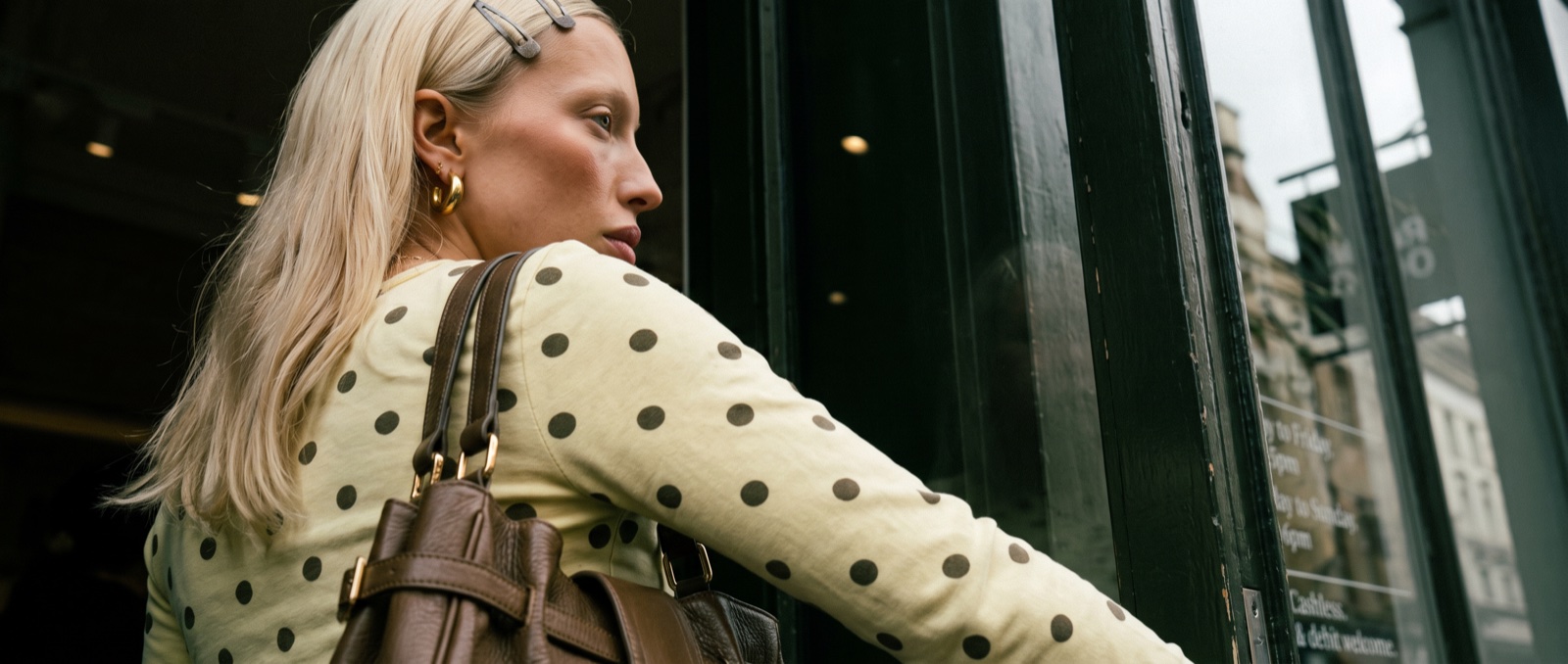
Bold color outfits are not difficult because color is difficult. They are difficult because most people treat color like decoration, then wonder why the outfit starts looking noisy, cute in the wrong way or suspiciously close to a mood board that never made it outside.
I do not think the answer is to become braver in some vague inspirational sense. The answer is to become more disciplined. Bright color needs weight. It needs friction. The discipline is closer to KiiiKiii color combinations for everyday Y2K outfits than to throwing every loud shade on at once — and it pairs well with the small-detail logic in Korean summer styling trends. It needs a piece that looks slightly too practical, too ugly, too heavy or too severe, because sweetness without a counterweight turns into costume very quickly.
That is the difference between colorful outfit ideas that feel styled and ones that feel like a theme day. The best looks here are not screaming “look, I wore color.” They are using saturated pieces as part of a bigger argument: texture against softness, grey against red, brown against yellow, silver against pink, utility against sleepwear. That is where bold color starts to look adult.
Start with a soft color, then toughen everything around it
Pink sweatpants are dangerous in the best possible way. They can look relaxed, strange and expensive if the rest of the outfit has enough control. They can also look like actual pajamas if you surround them with more softness.
This is why the army-green utility jacket works. The color is dull, practical and slightly cold, which immediately cuts through the sugary pink. The white tee keeps the outfit open, while the red lettering quietly echoes the sweatpants without making the whole thing match. That small related-color move is important. It makes the pink feel chosen, not accidental.
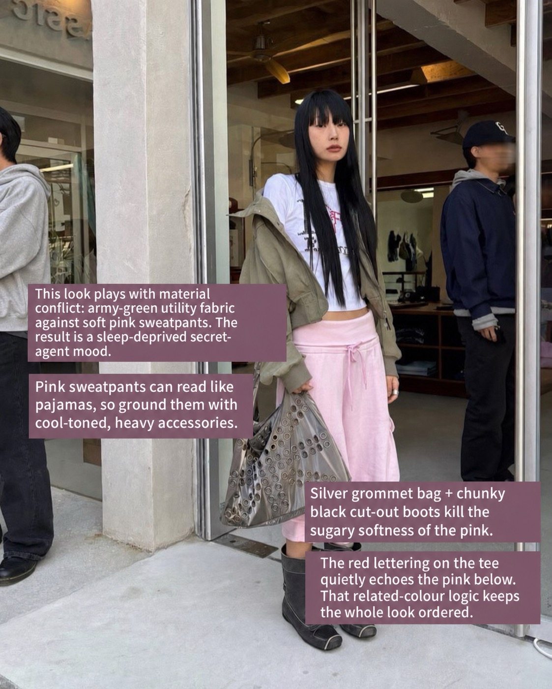
The accessories do even more work. A silver grommet bag and chunky black cut-out boots make the pink less pretty. I love that because a pink sweatpants outfit should not be styled like loungewear if the goal is to leave the house and look intentional. The boots give the lower half a hard stop. The bag adds metallic texture. Suddenly the sweatpants are not childish; they are the weird soft center of a much colder outfit.
If you are wondering how to style pink sweatpants, I would start there: add one utility layer, one metallic or hardware-heavy accessory and one black shoe with visual weight. Do not add a tiny white sneaker and hope for the best. That is how the outfit starts drifting back toward “quick errand” when it could have been sleep-deprived secret agent.
Let one saturated piece boss the whole look around
A patchwork jacket already contains a lot of information. Pattern, texture, color, quilting, softness, nostalgia: it is not a quiet object. The lazy instinct would be to make everything else plain, but that can make the outfit look top-heavy, like the jacket is wearing the person.
The huge red tote solves that problem because it gives the chaos a focal point. It does not reduce the busyness. It organizes it. That is a different thing, and it is one of the better lessons for maximalist styling.
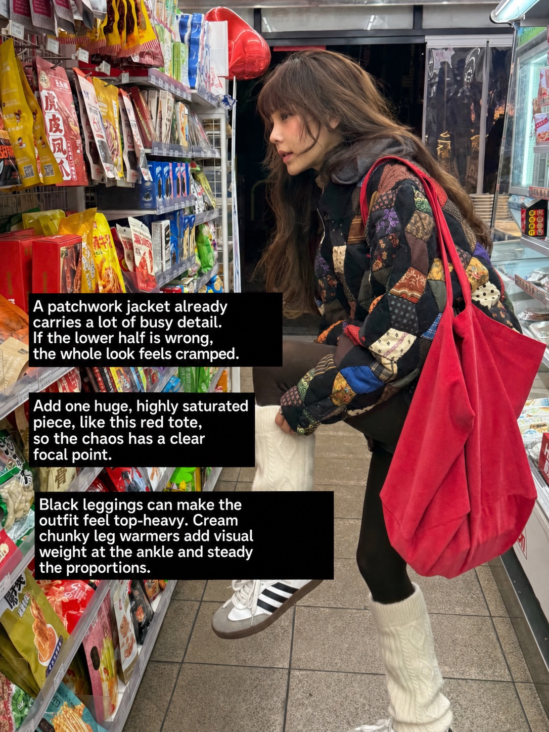
This is also why the cream leg warmers matter. Black leggings can disappear too cleanly under a loud jacket, leaving the whole outfit visually lopsided. The chunky cream layer adds weight at the ankle, pulls the eye down and makes the silhouette feel considered.
For a red tote bag outfit, I would avoid thinking of the bag as a cute pop of color. That phrase has done enough damage. A red bag this big is not an accent. It is a command. Let it be one. Keep the base dark, add something textural at the shoe or ankle, then let the bag hold the outfit together with a little theatrical force.
Use brown when color starts getting too sweet
Polka dots already carry a kind of geek energy. They are charming, but they can become twee very quickly, especially when the base color is pale yellow. The reason this look works is that it refuses the obvious route. No mini skirt, no tiny Mary Janes, no sugary little bag.
Instead, the knee-length brown shorts make the outfit stranger and more gender-neutral. They break the expected silhouette and drag the whole thing away from retro-girl sweetness.
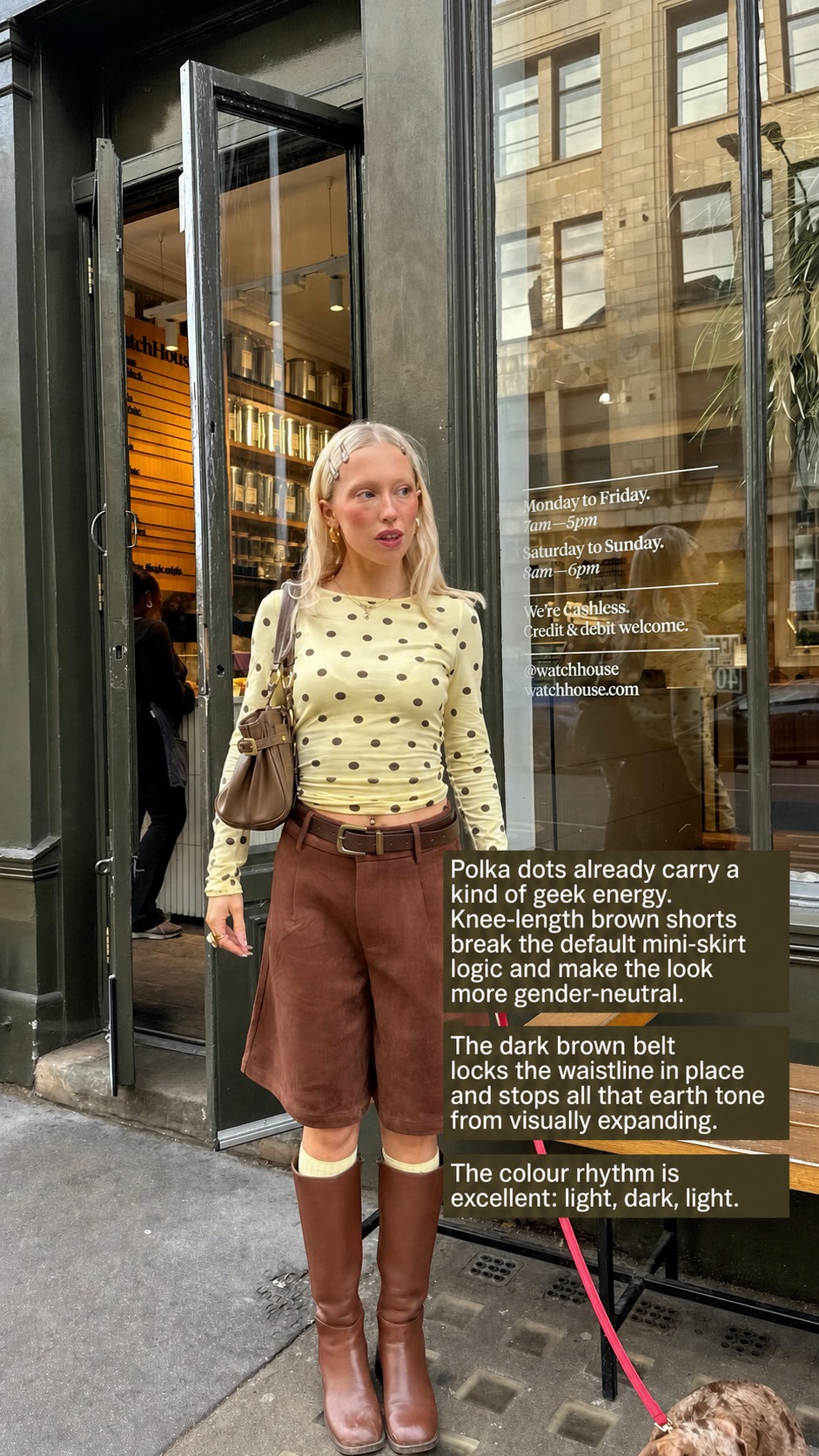
The belt is doing quiet structural work. It locks the waistline in place and stops the earth tones from visually expanding. Without it, the brown shorts and brown boots might become one heavy block. With it, the outfit has rhythm: light top, dark middle, light socks, dark boots.
This is a good example of how bold color outfits do not always need neon or primary colors. Sometimes the boldness is in the refusal to style a pretty color prettily. Pale yellow becomes much more interesting when it is forced to sit next to muddy brown, practical shorts and tall boots.
Use grey as a buffer, not a retreat
Grey is often treated like the place color goes to die. I disagree. Grey can be one of the strongest tools for how to wear bright colors because it gives saturation somewhere to land.
In this look, the body is wrapped in several shades of grey: hoodie, skirt, socks, layered knit, concrete wall. That could be flat, but the red bag snaps the whole thing awake. The bag does not need to be huge here because the background is already so controlled. It just needs enough saturation to pull the dystopian softness back into city style.
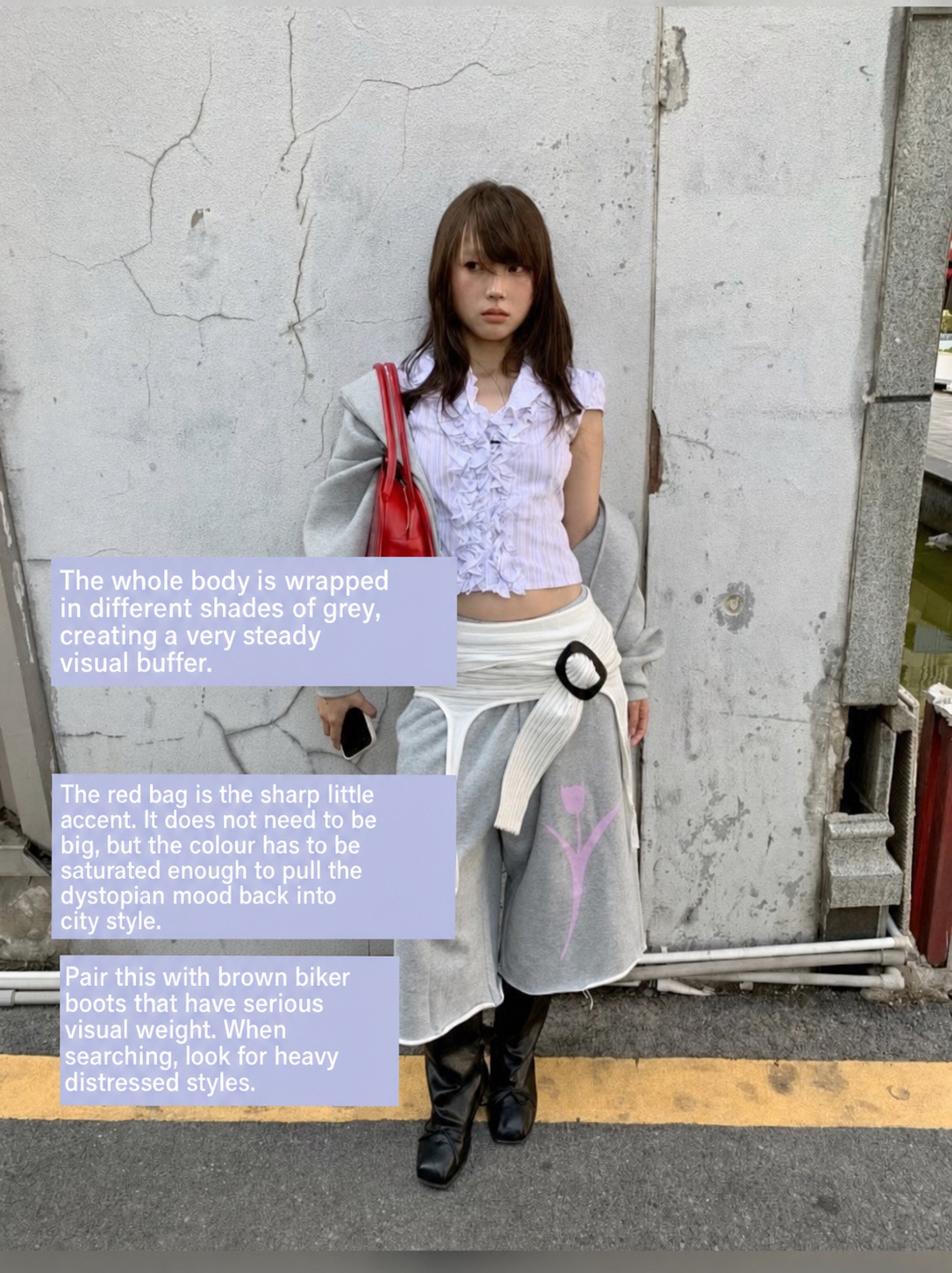
The brown biker boots are the correct shoe because they have weight. A delicate flat would make the outfit feel unfinished. A clean sneaker would make it too easy. The boot gives the look an uglier edge, which is exactly what keeps the red bag from looking like a decorative afterthought.
This is the kind of color blocking outfit idea I actually trust: not a loud block of blue against orange because a chart said they work together, but a grey field interrupted by one sharp color and grounded by one heavy shoe. It is simple, but not simplistic.
Let bad taste do some useful work
I love when one almost-disastrous item saves an outfit from being too tasteful. This yellow sweater could easily become soft, proper and a bit rich-aunt-on-holiday. The silver bag, pink socks and embellished shoes push it somewhere much better.
The logic is localised brightness. The yellow is large, the pink is small but screaming, the metallic bag cuts through both, and the shoes add just enough ornament to keep the whole thing from becoming polite. Somehow, and I do mean somehow, it avoids looking tacky.
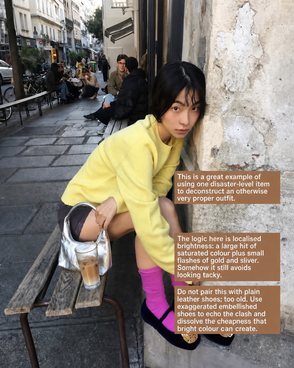
This is where a color clash outfit can become stylish rather than desperate. The clash needs an internal rhythm. Yellow and pink are both sweet, but the silver bag is cold. The black shoes are heavy. The gold detail on the shoes talks to the yellow without matching it. Nothing is random, even if the final effect looks a little chaotic.
I would not pair this with plain leather shoes. Too old, too safe, too “I bought the bright jumper but lost my nerve at the last second.” If the color is already loud, the styling has to stand up to it.
The formula is controlled friction
When these looks sit together, the pattern becomes obvious. The best bold color outfits are not built from confidence alone. They are built from controlled friction.
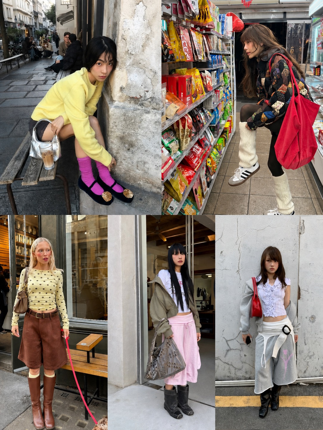
If the color is soft, add utility or hardware. If the jacket is busy, give the outfit one saturated focal point. If the top is sweet, use brown, black or grey to toughen it. If the color is bright enough to look cheap, add texture that makes the cheapness deliberate: metallics, distressed leather, heavy boots, thick socks, patchwork or a bag that refuses to behave like a small accessory.
This is why eclectic outfit ideas often work better than clean minimalist ones for bright color. Color wants context. It wants an argument. A pink sweatpant next to a silver grommet bag makes more sense than a pink sweatpant trying to be innocent. A red tote on a patchwork outfit makes more sense than a red tote politely “popping” against beige.
The whole thing is very no-core to me. Not because the looks are impossible to describe, but because they resist being flattened into one neat aesthetic. They are sporty, girlish, weird, dystopian, casual and a little ugly. That friction is the point.
What I would avoid
I would avoid wearing multiple bright pieces that all have the same emotional temperature. Pink with lavender with baby blue with soft white can work, but it needs a hard interruption. Otherwise the outfit becomes dessert.
I would also avoid thinking every bold outfit needs a rainbow. Most strong bright color outfit ideas are more selective than that. One saturated bag, one pink pant, one yellow sweater, one red strap. The color lands harder when it has space around it.
Most of all, I would avoid over-clean styling. Bright color with pristine basics often looks strangely timid. If the outfit is already asking for attention, give it texture, weight and contradiction. A little wrongness makes the color look intentional.
FAQ
How do you wear bold color outfits without looking childish?
Use one bright piece, then ground it with heavier textures, darker accessories or practical layers. Pink sweatpants need boots or hardware. A red bag needs structure around it. Bright color looks more adult when it has friction.
What colors are easiest to wear in bold outfits?
Red, pink, yellow and pale blue are easy starting points because they can be paired with grounded neutrals like grey, brown, black, olive and cream. The trick is to control the saturation instead of adding more color everywhere.
How do I make colorful outfit ideas look intentional?
Give the outfit one clear focal point. That could be a red tote, a yellow knit, pink sweatpants or a bright sock. Then repeat one color subtly, add texture and keep the shoe strong enough to balance the look.
Are maximalist outfit ideas the same as wearing lots of color?
No. Maximalist styling is about visual information: texture, shape, proportion, color, accessories and contrast. You can have a maximalist outfit with only one bright piece if the rest of the styling has enough tension.
What is the easiest way to start wearing bright colors?
Start with one bright accessory or one casual piece, like a red bag or pink sweatpants. Keep the rest of the outfit grounded, then add one texture that feels slightly harsh: leather, metal, distressed boots, grommets, thick knit or patchwork.