
Artist Capsule Wardrobe: How to Choose Tech Accessories That Belong in a Fixed Palette
A compatibility checklist for adding wearable tech to an artist's capsule wardrobe — color system, logo control, form longevity, and identity fit.
An artist capsule wardrobe is built to disappear. The same black trousers, the same white shirt, the same grey coat — not because nothing else is available, but because every decision already made is one fewer decision competing with the work. The palette is fixed. The rotation is small. The pieces are interchangeable across studio, gallery, meeting, and dinner. Everything in the system exists because it earns its slot.
Tech accessories almost never earn their slot. A pair of earbuds in translucent white plastic, a fitness tracker in neon-accented rubber, a smartwatch with a branded face — each one introduces a color, a material, or a logo that the rest of the wardrobe was specifically built to exclude. The accessory does not integrate. It interrupts. And in a wardrobe where interruption is the one thing the wearer has already decided against, that interruption is permanent.
This is a compatibility checklist for the opposite outcome: choosing a tech accessory that enters the capsule the same way a good pair of black boots does — as a fixed component, not a rotating guest.
Why most tech accessories break a capsule wardrobe
A capsule wardrobe works because every piece shares a material language. Fabrics are matte or softly textured. Colors stay within a closed system — typically black, white, grey, navy, or a single accent. Metals, when present, are consistent: all silver, or all gold, never mixed. Branding is minimal or absent. The visual effect is coherence, and coherence is fragile. One object that violates the rules is enough to make the entire system feel accidental.
Consumer electronics are designed for product differentiation, not wardrobe coherence. Their colors are chosen to stand out on a retail shelf. Their surfaces are chosen for grip and durability, not for how they sit next to wool or cotton. Their logos are chosen for brand recognition, not for visual silence. Every one of these priorities is in direct opposition to what a capsule wardrobe demands.
The result: someone who has spent years refining a precise personal uniform puts on a pair of earbuds and suddenly looks like they borrowed them from a different person’s life.
Five compatibility standards for capsule-ready tech
1. Color system — native, not approximate
The accessory’s color must be native to the wardrobe’s palette, not a close approximation. In a black-silver-white system — the most common artist capsule palette — that means true silver metal, true white stone or surface, and true black hardware. Off-white, cream, champagne gold, and rose tones are approximations that create visible mismatches under daylight.

The test is simple: hold the accessory against the sleeve of your most-worn jacket. If the colors are from the same family, it belongs. If you can see a temperature gap — warm against cool, yellow against blue-white — it will never sit right.
2. Logo — absent, not minimized
No logo accessories are the only accessories that belong in a capsule wardrobe. A small logo is still a logo. A debossed logo is still a logo. A tone-on-tone logo that only appears under certain light is, under that light, still a logo. The point of a personal uniform is that the wearer’s identity comes from the silhouette, the palette, and the material — not from a brand mark. Any visible branding converts the accessory from a personal choice into a product advertisement, and product advertisements do not belong in a system built around self-definition.
Wearable identity objects — pieces that communicate who the wearer is rather than what they bought — require this discipline. The object can have a maker. It should not display one.
3. Form longevity — timeless, not trend-responsive
Capsule wardrobes outlast seasons. A black blazer purchased in 2019 should still work in 2027. The same standard applies to any tech accessory that earns a permanent slot.
Timeless tech accessories are defined by forms that do not reference a specific design trend or product generation. A stem that mimics a current-generation earbud shape will look dated when the next generation changes the silhouette. A sculptural form rooted in material — a faceted stone, a metallic contour, an architectural profile — does not age the same way because it was never tied to a product cycle in the first place. Polished wearable tech that references jewelry proportions rather than gadget proportions is more likely to survive multiple wardrobe cycles.
4. Context range — studio to dinner in the same piece
The operational definition of a capsule wardrobe component is: it works in every context the wearer moves through in a day. For an artist, designer, or creative professional, that range typically spans studio work, client meetings, gallery openings, lectures, and evening social settings.
Daily avant garde accessories must pass this range test. A piece that reads as too editorial for a video call, or too corporate for a studio visit, fails the capsule test even if its color and form are right. The accessory must carry visual interest without carrying context dependency. It should look intentional at 9 AM and equally intentional at 10 PM without the wearer having to think about whether to swap it out.
5. Identity function — does it say something about the wearer?
The difference between a capsule wardrobe component and a neutral filler is identity. A plain black watch fills a slot. A silver sculptural ear piece defines a slot. Digital identity accessories and future body accessories occupy this territory: objects that become part of how the wearer is recognized, remembered, and visually understood by others.
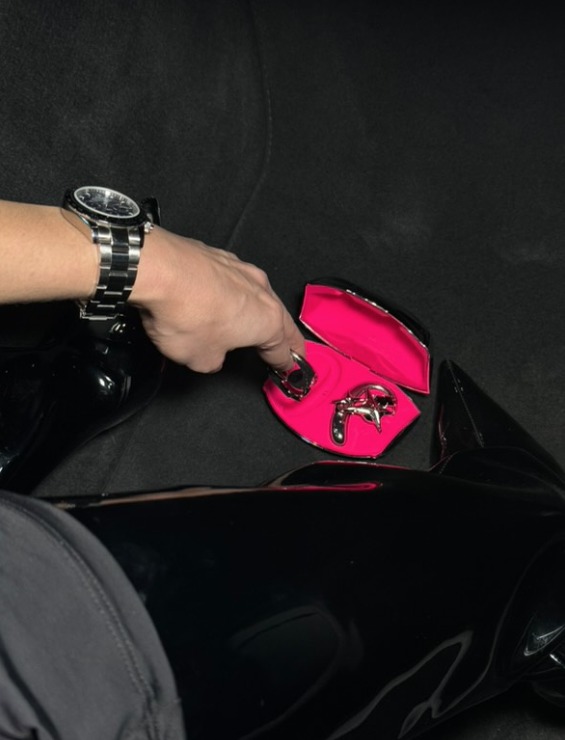
In a fixed-palette wardrobe, the few non-clothing objects — glasses, watch, ring, ear piece — do disproportionate identity work. They are the points of differentiation in a system that otherwise resists differentiation. A tech accessory that earns this position becomes part of the wearer’s visual signature, not just a tool they happen to be wearing.
How wearable audio fits the capsule model
Wearable audio style sits at an unusual intersection for capsule wardrobes. Most audio devices are designed to be invisible (in-ear buds that disappear) or functional (over-ear headphones that announce themselves as equipment). Neither mode is compatible with a capsule system, because the capsule demands components that are visible, intentional, and coherent — not hidden, and not foreign.
The third mode — audio objects designed as visible accessories — is the one that integrates. When an earphone is built to the same standards as an ear cuff or a drop earring — matching the wardrobe’s metal tone, carrying no brand mark, holding a form that outlasts product cycles — it enters the capsule as a permanent component rather than a technological intrusion.
Two components built for a black-silver-white system
OFHUNGER makes wearable tech designed as everyday accessories — open earphones built as ear jewelry. In a black-silver-white capsule, two of its lines slot in as native components rather than additions.
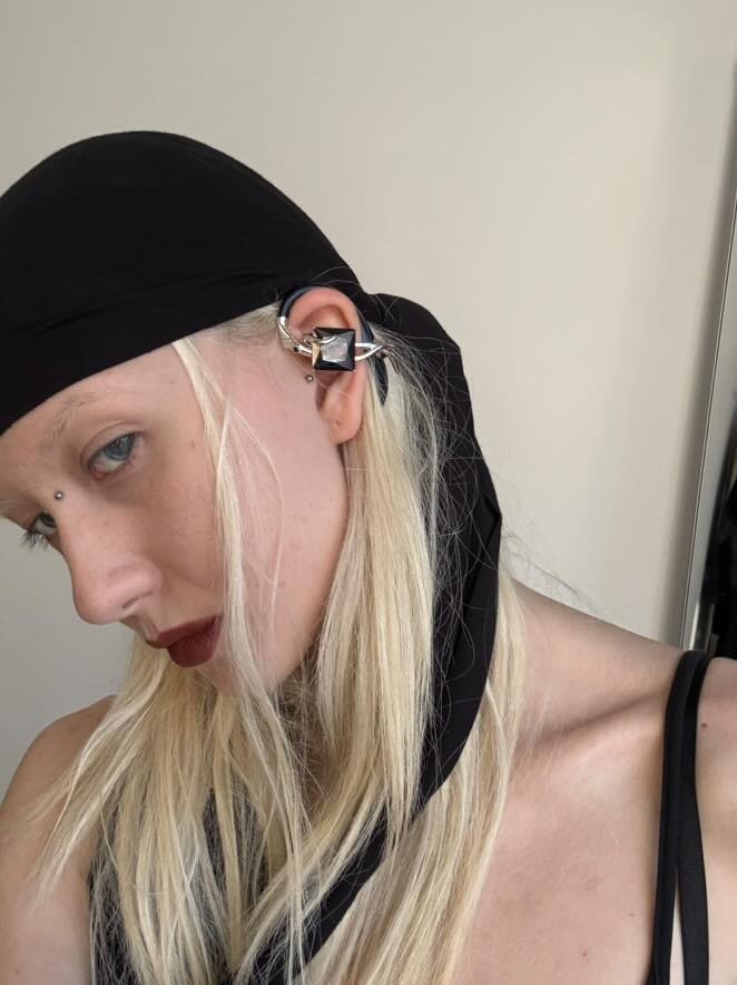
Everyday fixed slot: Electronic Gems. The Silver-White Zircon is silver metal and white stone — no color translation needed for a black-silver-white palette. The body is 18K white gold plated copper with no logo on the wearing face. The silhouette is a faceted gemstone drop, which means it references mineral form rather than a product generation, and will not look dated when earphone design trends move on. It works in a studio at 9 AM and at a gallery opening at 9 PM without a swap. At USD 310, it earns its slot the same way a good silver ring does: by being the piece you stop thinking about because it is always right. For a quieter entry at USD 290, the White Zircon offers the same palette compatibility with a slightly smaller visual footprint.
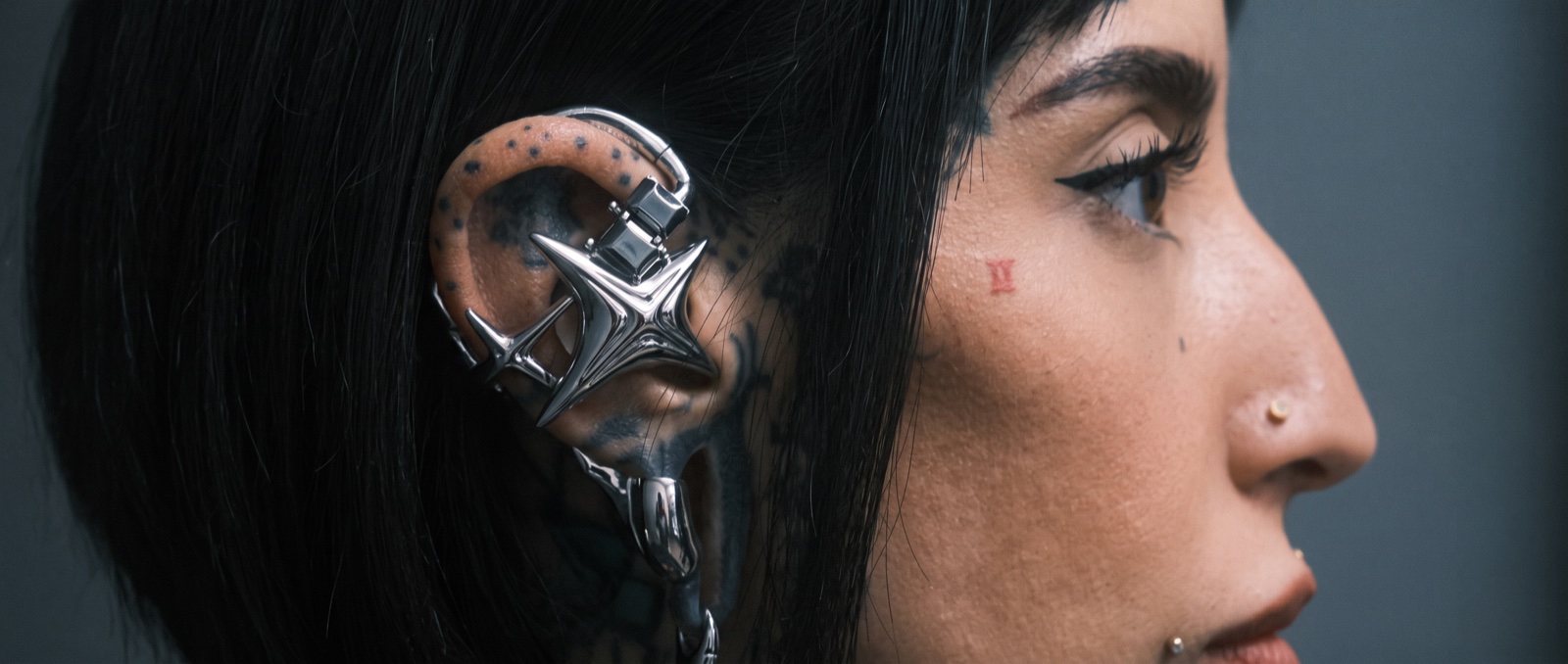
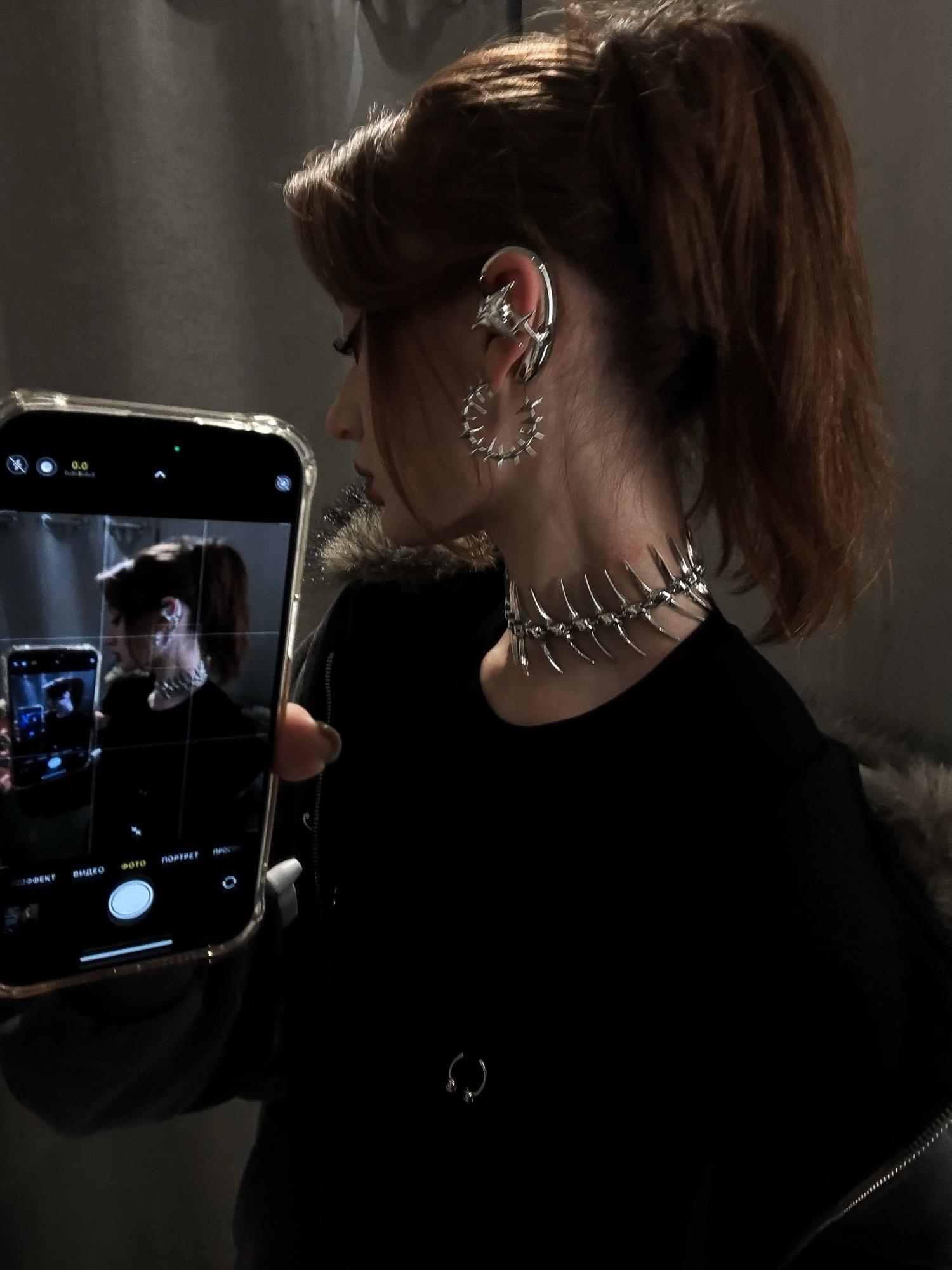
Higher-volume identity slot: NEBULA Silver. When the capsule wearer wants a piece that does more identity work — lectures, press photos, exhibition openings — the NEBULA in Silver provides a larger sculptural form at USD 360. The silhouette projects further, casts a more defined shadow, and reads as a design statement at wider distances. The color remains native silver, the surface remains polished metal, and the logo remains absent. It is the same capsule logic at a higher visual volume — a component, not a costume.

Both are visible in community wear on the OFHUNGER Style page, which shows real people in real wardrobes — the most practical way to evaluate whether a piece will integrate with your own.
The capsule compatibility check
Before adding any tech accessory to a fixed-palette wardrobe, run five questions:
- Color. Hold it against your most-worn piece. Same temperature, same family, or a visible gap?
- Logo. Can you see a brand mark from any wearing angle? If yes, it is a product, not a component.
- Form. Will this shape reference a specific product era in three years, or will it still read as a material form?
- Range. Can you wear it from your first meeting to your last event without swapping or second-guessing?
- Identity. If someone described your look to a stranger, would this piece be part of the description?
A capsule wardrobe is a closed system. Anything that enters it should make the system more coherent, not less. The same rule that governs your black trousers governs your earphones: if it does not belong, it does not stay.