
Y2K Outfits and the Frutiger Metro K-Pop Mood
A trend note on KiiiKiii, Frutiger Metro visuals, and why Y2K outfits feel fresher when they borrow from digital nostalgia.
I think the reason Y2K outfits keep coming back is not because everyone suddenly wants to dress like a 2003 mall rat in peace. It is because the aesthetic still knows how to make the future feel touchable. Not sleek. Not sterile. Touchable. Bubble letters, plastic packaging, glossy hair, cheap-looking shine that somehow feels expensive when it is done with enough conviction.
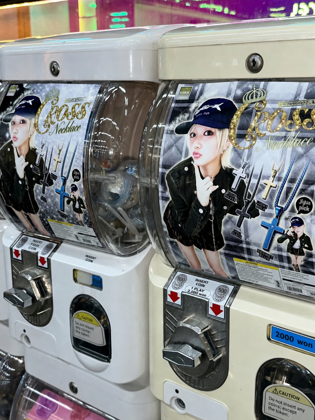
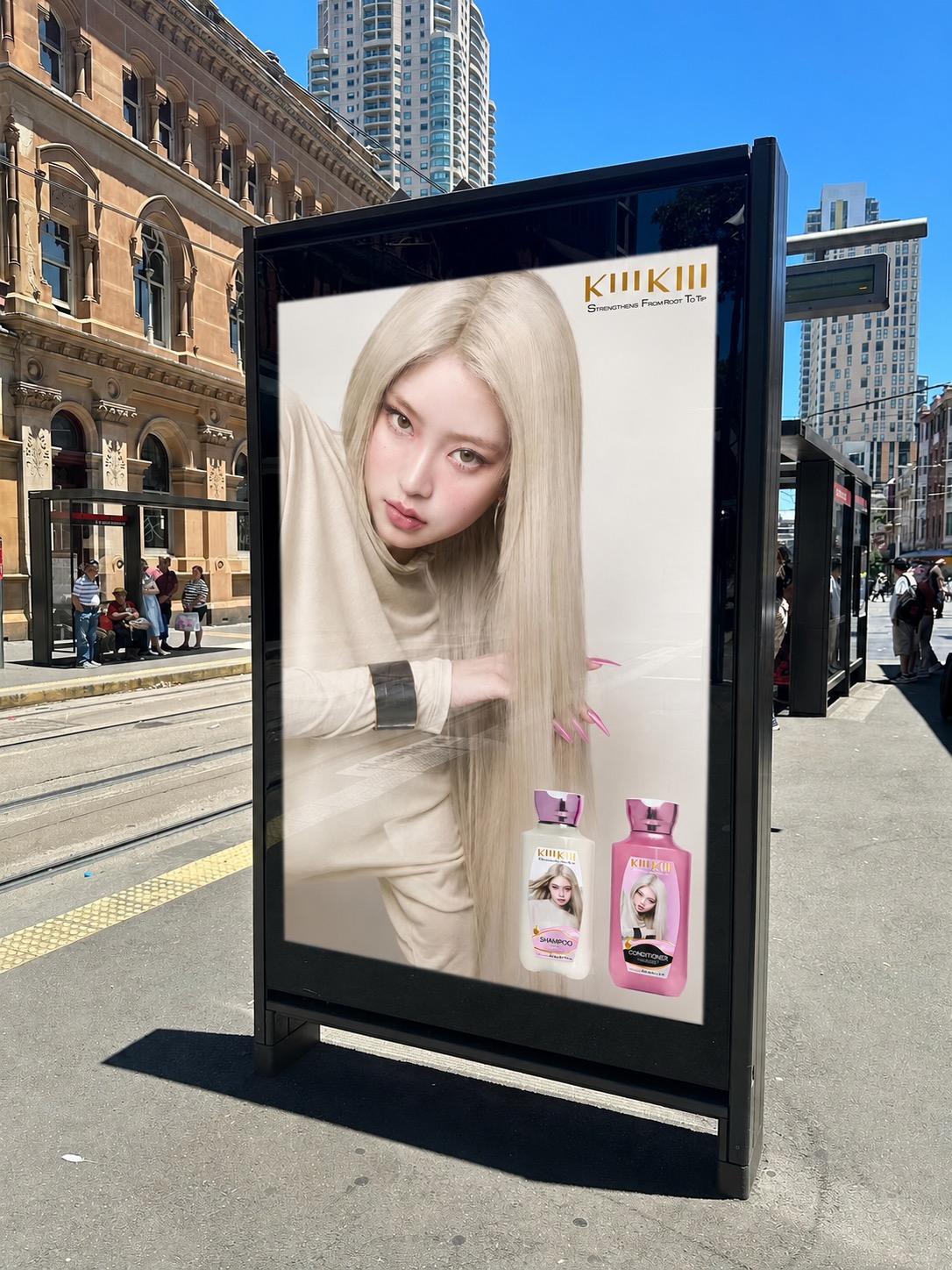
That is why KiiiKiii’s recent visual world feels more interesting than another flat nostalgia exercise. The group, listed on Starship Entertainment’s official artist page, is working with the kind of Y2K visual design that understands memory as a texture. It is not just low-rise jeans and pink. It is vending machines, gacha capsules, fake product packaging, chunky arrows, heart-shaped rails, chrome-ish objects, airport screens, and a slightly unserious relationship with commercial design.
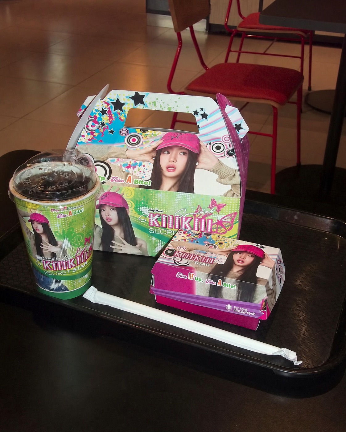
The images around the “DANCING ALONE” era are especially useful because they show why Y2K outfits now need more than vintage silhouettes. Kakao Entertainment’s newsroom framed the single as part of KiiiKiii’s wider visual rollout for “DANCING ALONE”, but what catches my eye is not simply comeback styling. It is the way the styling gets absorbed into a whole retail fantasy.
The Outfit Is No Longer Just the Clothes
The mistake people make with Y2K outfits is treating them like a checklist. Baby tee? Done. Bootcut jeans? Done. Metallic bag? Done. But the stronger version of the look is not item-based. It is environment-based.
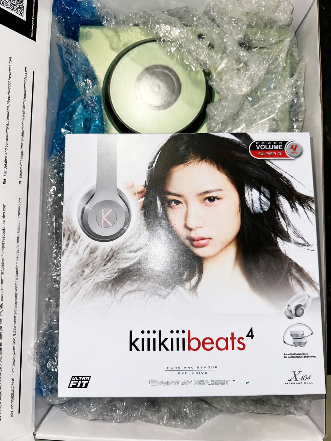
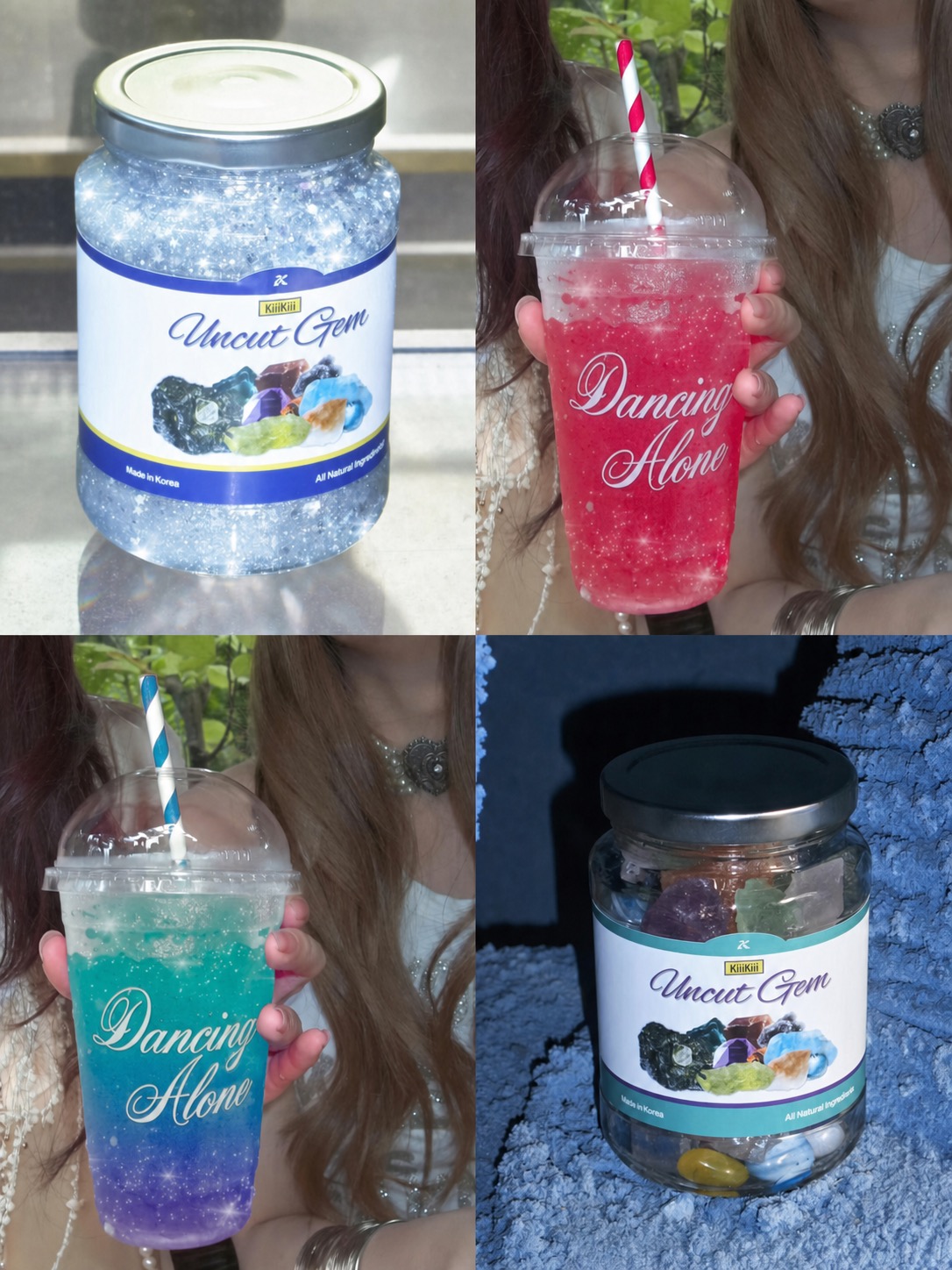
Look at the packaging and vending-machine images. The outfit is not sitting in isolation; it is being folded into a tiny commercial universe. A headset box becomes part of the styling. A coffee cup becomes branding. A clock, makeup palette, bubble gum tin, haircare ad, and drink label all join the moodboard. That is very Frutiger Metro, even when the reference is not literal.
Frutiger Metro is usually discussed as a branch of 2000s interface and public-design nostalgia: rounded forms, bright gradients, accessible type, soft futurism, and graphic optimism. What matters for fashion is the feeling. It makes technology look friendly, almost edible. That is exactly the opposite of the cold, aggressive cyberpunk mood that dominated so many futuristic references.
Why Frutiger Metro Makes Y2K Feel Less Costume
Y2K can tip into costume very quickly. We have all seen the outfit that looks like it was assembled by searching “2000s aesthetic” and stopping at the first five results. The more interesting approach is to borrow the visual logic, not just the objects.
Frutiger Metro gives Y2K outfits a system. The colours are saturated but not gothic. The shapes are rounded, glossy, and approachable. The graphics behave like packaging, screens, stickers, and wayfinding signs. It feels like a school computer lab, a mall directory, a shampoo ad, and a pop video got shoved into the same zip file.
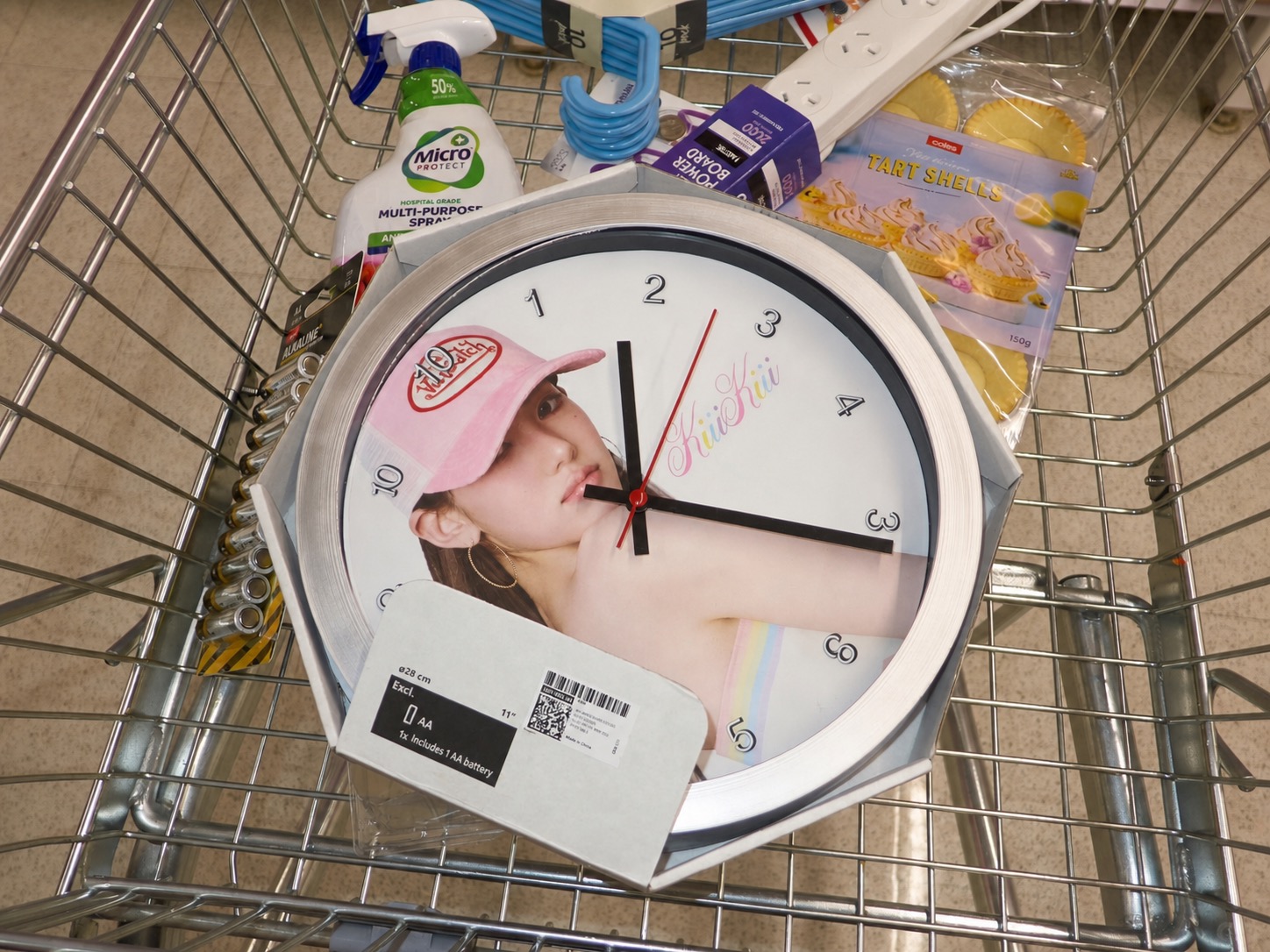
That matters because the best cyber Y2K fashion is not only about looking “futuristic.” It is about making the future feel commercially over-designed. Slightly fake. Slightly bright. Slightly too optimistic. In other words, the opposite of quiet luxury, thank God.
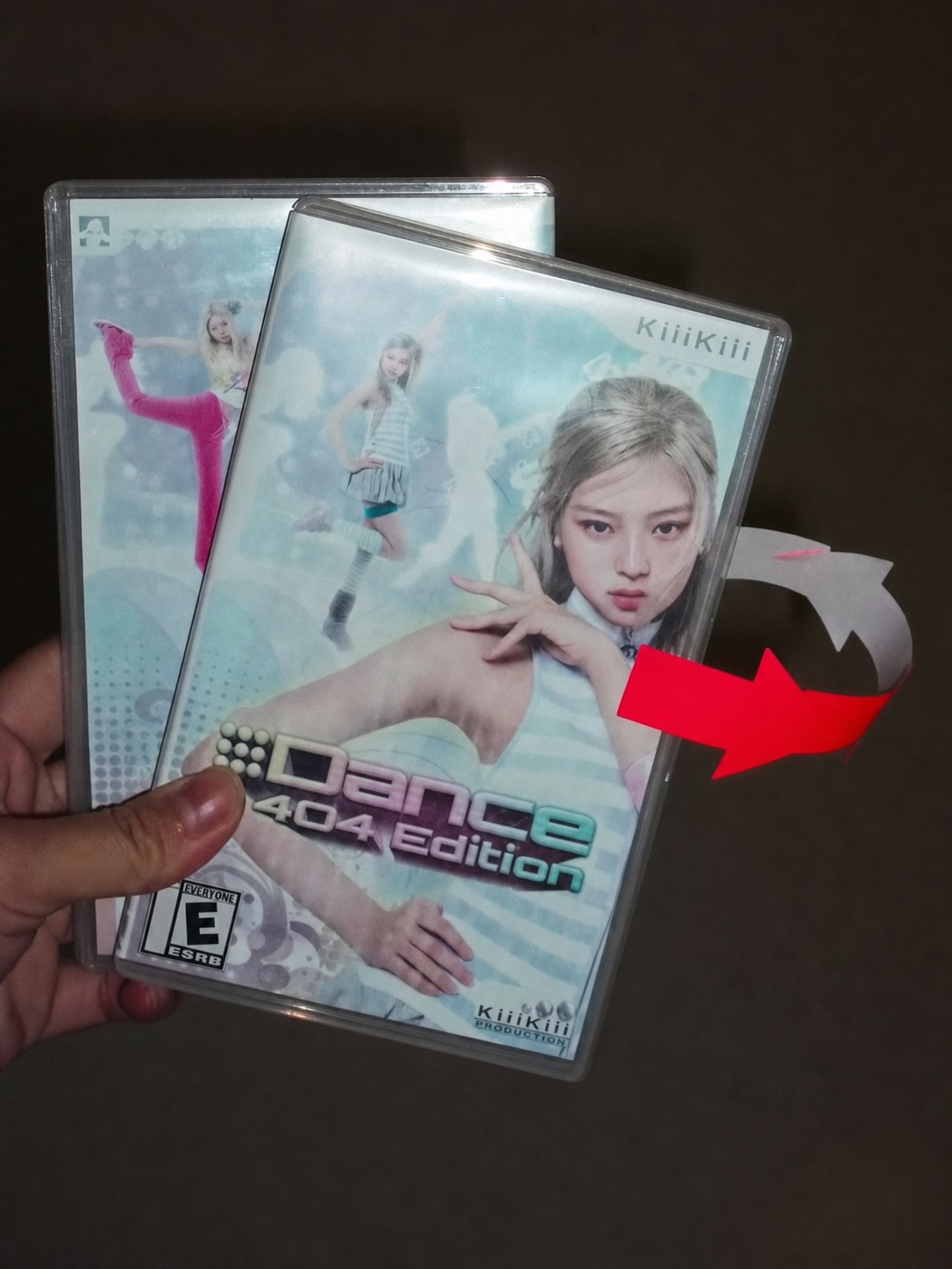
The Styling Formula: Soft Tech, Bright Friction, Visible Props
The outfits here work because they do not try to be too hard. There is denim, ribbed jersey, little bags, blonde hair, striped tops, soft knits, white boots, and glossy accessories. Then the world around them adds the digital edge.
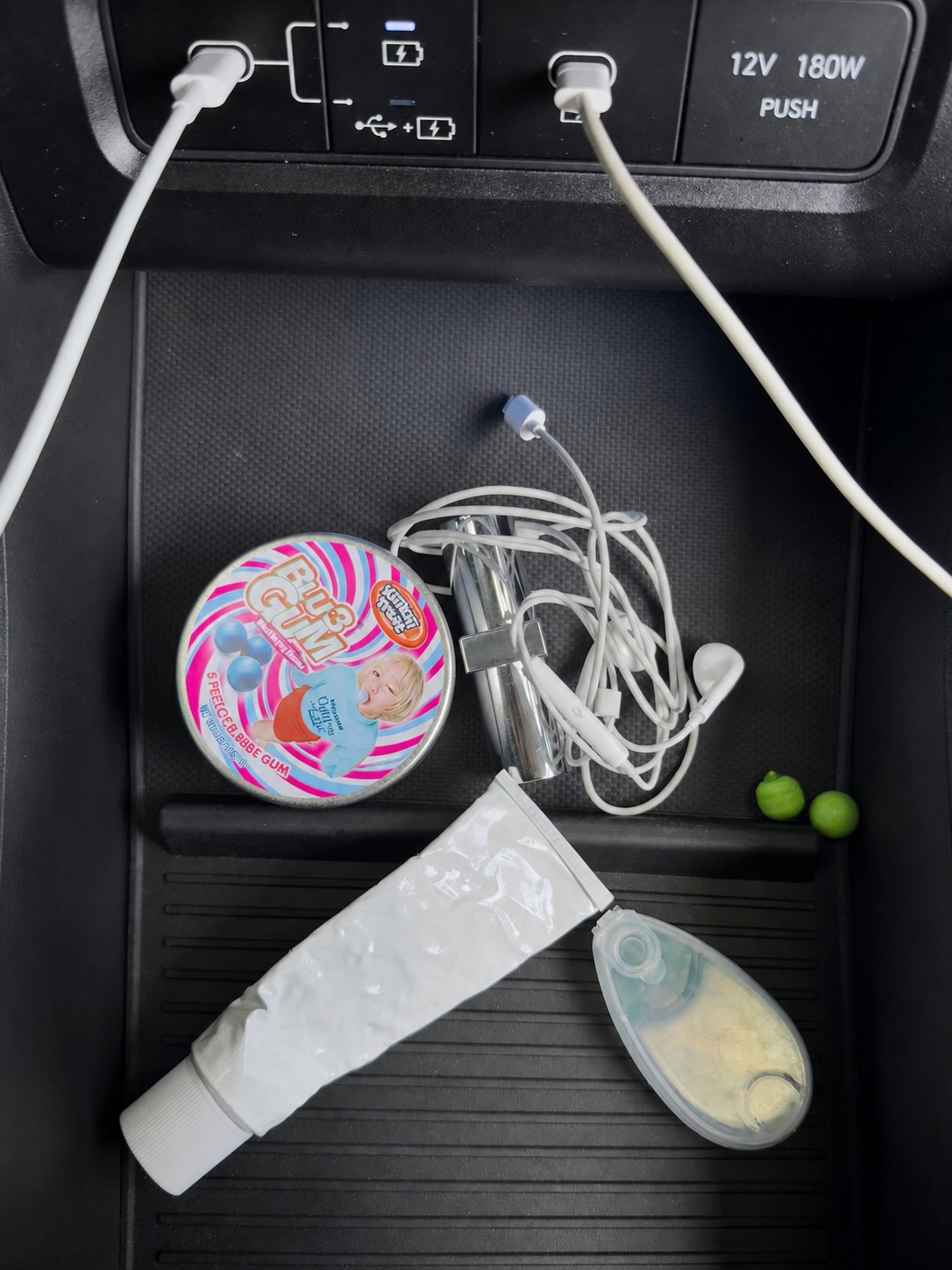
If I were translating this into wearable Y2K outfits, I would start with three rules. First, keep the clothes recognisable: jeans, tanks, fitted tops, mini skirts, zip hoodies, or slim knits. Second, add one tech-coded object: wired headphones, a chrome bag, reflective sunglasses, a glossy hair clip, a strange keychain. Third, use one colour that feels a bit too sweet for the rest of the outfit.
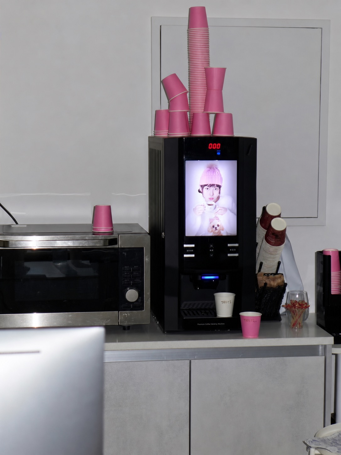
That is where the outfit stops being retro cosplay and becomes style. It has friction. The colours do not behave like a Pinterest template. The props are not decorative afterthoughts; they change the outfit’s reading.
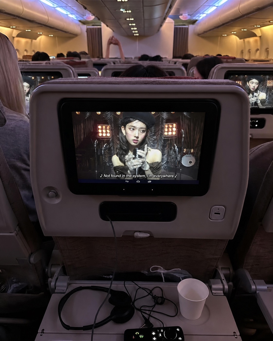
The Pop-Star Visual Language Is Doing the Heavy Lifting
K-pop has always understood that fashion is not just what is worn on the body. It is the whole visual economy around the body: packaging, album design, set design, makeup, hair, product fantasy, and choreography. That is why Kpop Y2K fashion often lands harder than Western retro styling. The reference is not treated as a mood; it is treated as infrastructure.
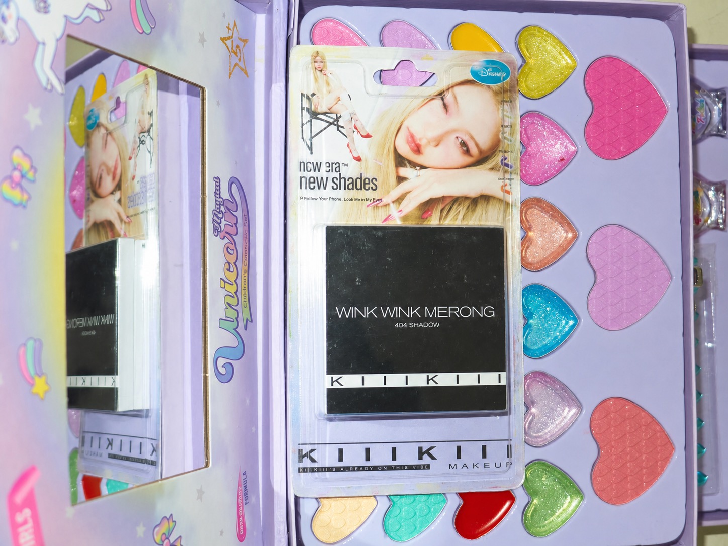
These images understand the internet-brained child of the 2000s. The person who saved low-resolution graphics, customised profile pages, saw beauty in random packaging, and knew that a product box could be as emotionally charged as an outfit. It is not tasteful in the old sense. It is taste built out of clutter, tabs, malls, screens, and commercial residue.
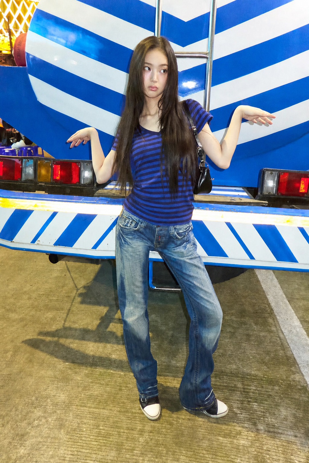
That is the part worth stealing for everyday dressing. You do not need a full fantasy set. You need one clear styling gesture that makes the outfit feel like it belongs to a larger visual system.
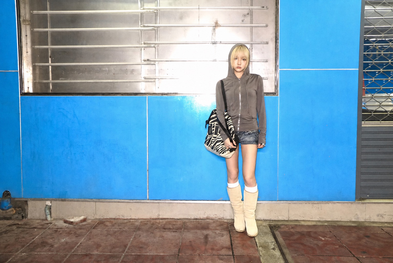
How to Wear the Mood Without Becoming a Walking Reference Folder
The easiest entry point is denim. Low or mid-rise jeans, a striped tee, a tiny shoulder bag, and a glossy accessory already get you into the room. Add a coloured knit, a plastic-looking charm, or a silver wearable tech object and the look starts speaking in Y3K fashion language without needing to scream “cyber.”
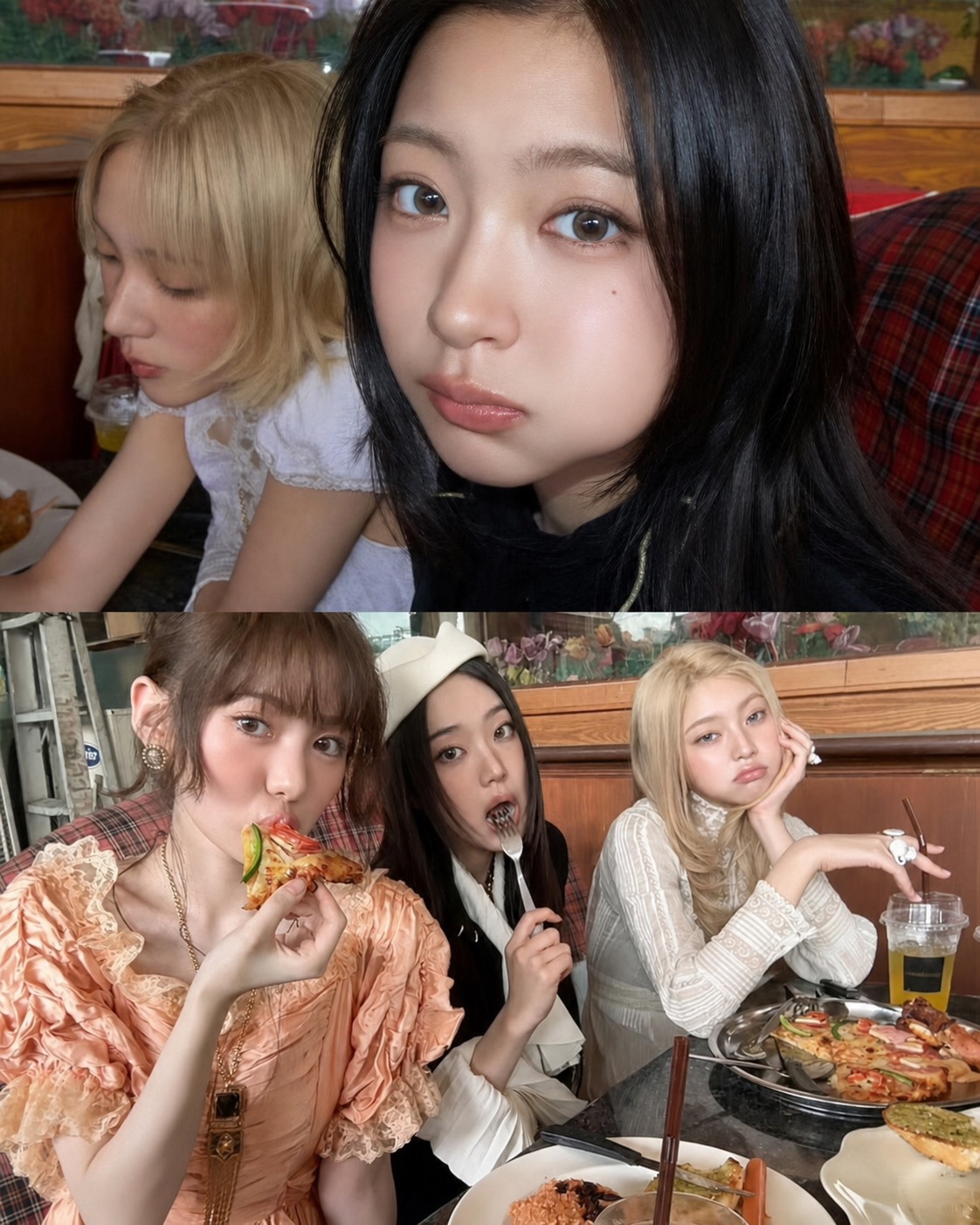
For a softer version, go romantic: white lace, pale knits, sheer socks, pale boots, and one absurdly bright accessory. The contrast is the point. Frutiger Metro fashion is not only neon and plastic; it also has that early-digital softness, the strange innocence of a web page that believed gradients could improve society.
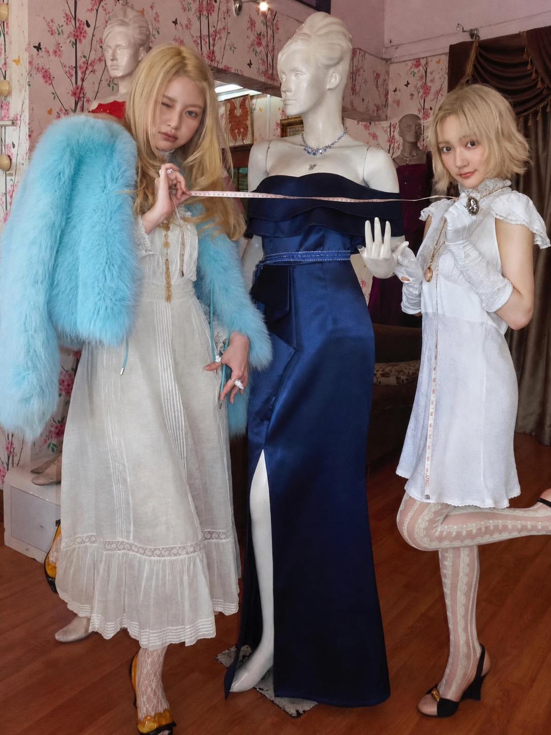
For a sharper version, keep the palette tighter: black, white, cobalt, silver, and one hit of pink or acid green. The outfit should look like it has been edited, not decorated. That is where cybercore fashion becomes more wearable. The clothes stay grounded, while the accessory or graphic detail carries the futurism.
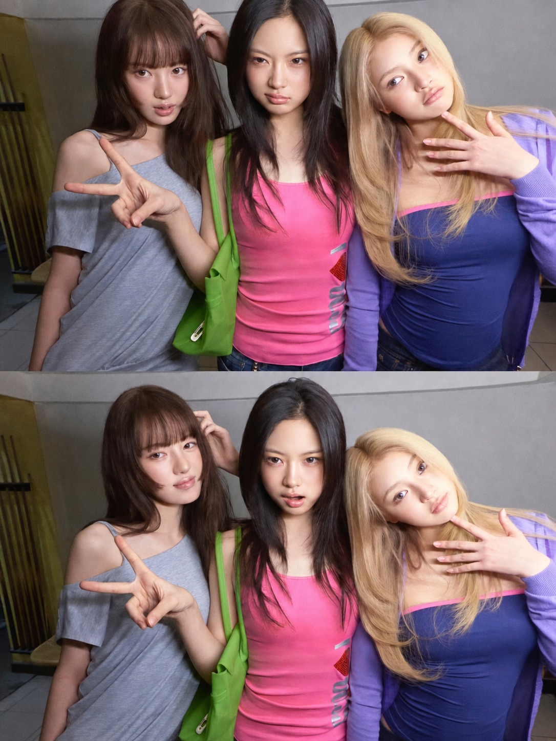
The Best Image in the Set Is Basically a Styling Manual
The annotated amusement-ride image spells out the whole trend better than a paragraph could: colourful neon lights, star-patterned seats, shiny quilted cushions, heart-shaped handrails, a portable speaker, and non-slip floor mats. It is a list of objects, but really it is a list of styling principles.
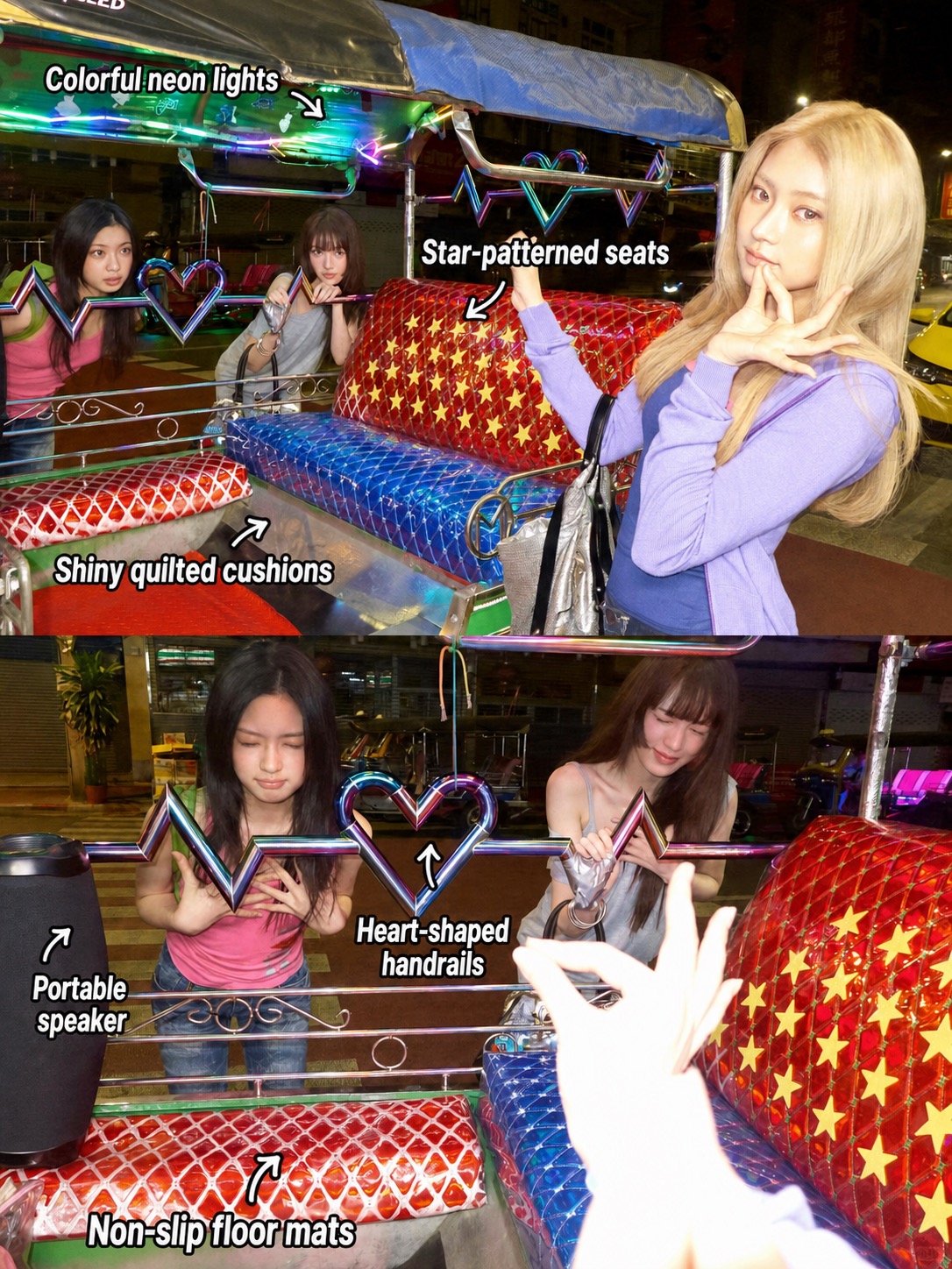
This is why Y2K outfits still have legs. The clothes are only the surface. Underneath is a whole material language: shine, plastic, chrome, candy colour, fake luxury, public signage, and objects that make everyday life look slightly staged. The future here is not minimal. It is over-labelled, over-packaged, and emotionally available.
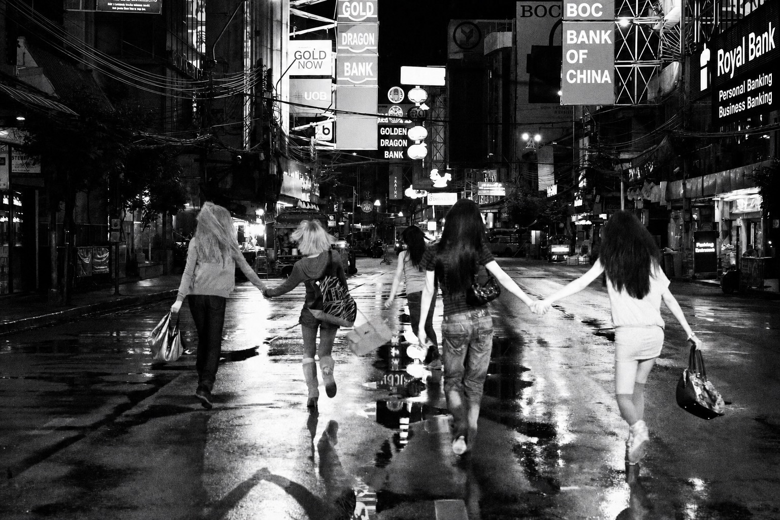
The black-and-white street image is a useful counterpoint. It reminds me that the trend does not need to stay cute. Strip the colour away and you still have movement, wet pavement, city lights, a group moving through an urban night. That is the skeleton under the sugar.
The Verdict
I would not call this nostalgia in the lazy sense. KiiiKiii’s visual world works because it treats Y2K as a design system, not a costume rail. The outfits matter, but so do the props, packaging, screens, public spaces, and commercial objects around them.
For anyone building Y2K outfits now, that is the lesson. Do not just wear the era. Build the interface around the look. Add an object that feels like it came from a mall kiosk, a game case, an early social profile, or a beauty ad that took itself far too seriously. That is where the outfit becomes harder to flatten, harder to copy, and much more fun.
FAQ
What makes Y2K outfits feel current again?
Y2K outfits feel current when they move beyond obvious retro items and use the era’s design logic: glossy surfaces, playful colour, visible tech, packaging references, and soft digital futurism.
What is Frutiger Metro aesthetic in fashion?
In fashion, Frutiger Metro aesthetic means borrowing from early-2000s interface culture: rounded graphics, saturated gradients, cheerful tech optimism, commercial packaging, and public-signage energy.
How do you style Kpop Y2K outfits without looking costume-like?
Keep the base wearable: denim, fitted knits, tanks, mini skirts, or simple hoodies. Then add one or two high-impact details such as chrome accessories, wired headphones, glossy bags, or candy-coloured pieces.
Is Y3K fashion different from Y2K fashion?
Yes, but they overlap. Y2K fashion looks back to the early digital 2000s, while Y3K fashion pushes that language into a more futuristic, cyber, metallic, and post-digital direction.